Less, but better!
Umesh Theratt / Product Design Portfolio
Vision / Design / SaaS / 2013-2019 / newtonhq.com

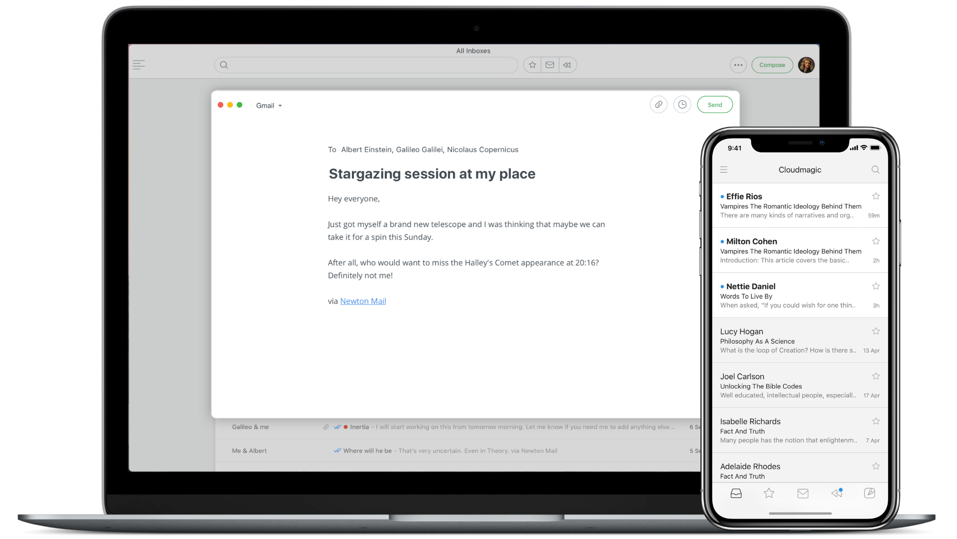
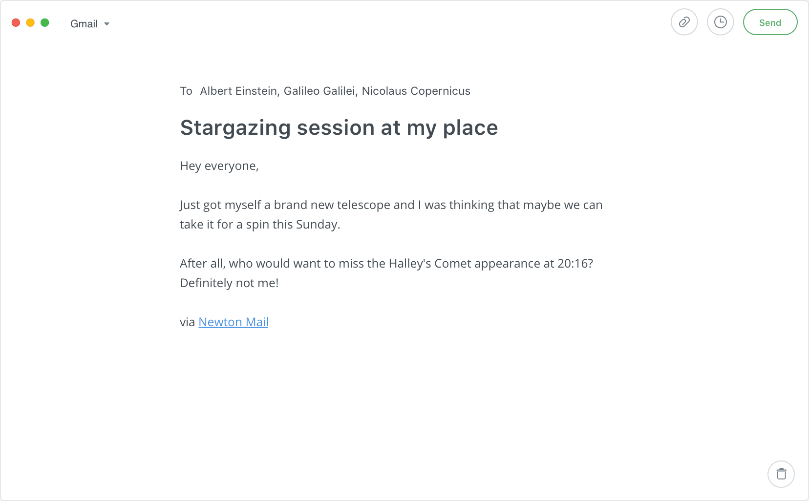
Newton is a beautiful email app that makes emailing a delightful and modern experience. It helps the user to focus, understand better, communicate better, take better actions, and quickly get back to life. With features like Read Receipts, Send Later, Sender Profile, Snooze and more for modern-day business communication. Available on iOS, Android, Mac, and Windows.Read More
Invention / Design / Product Feature / 2018

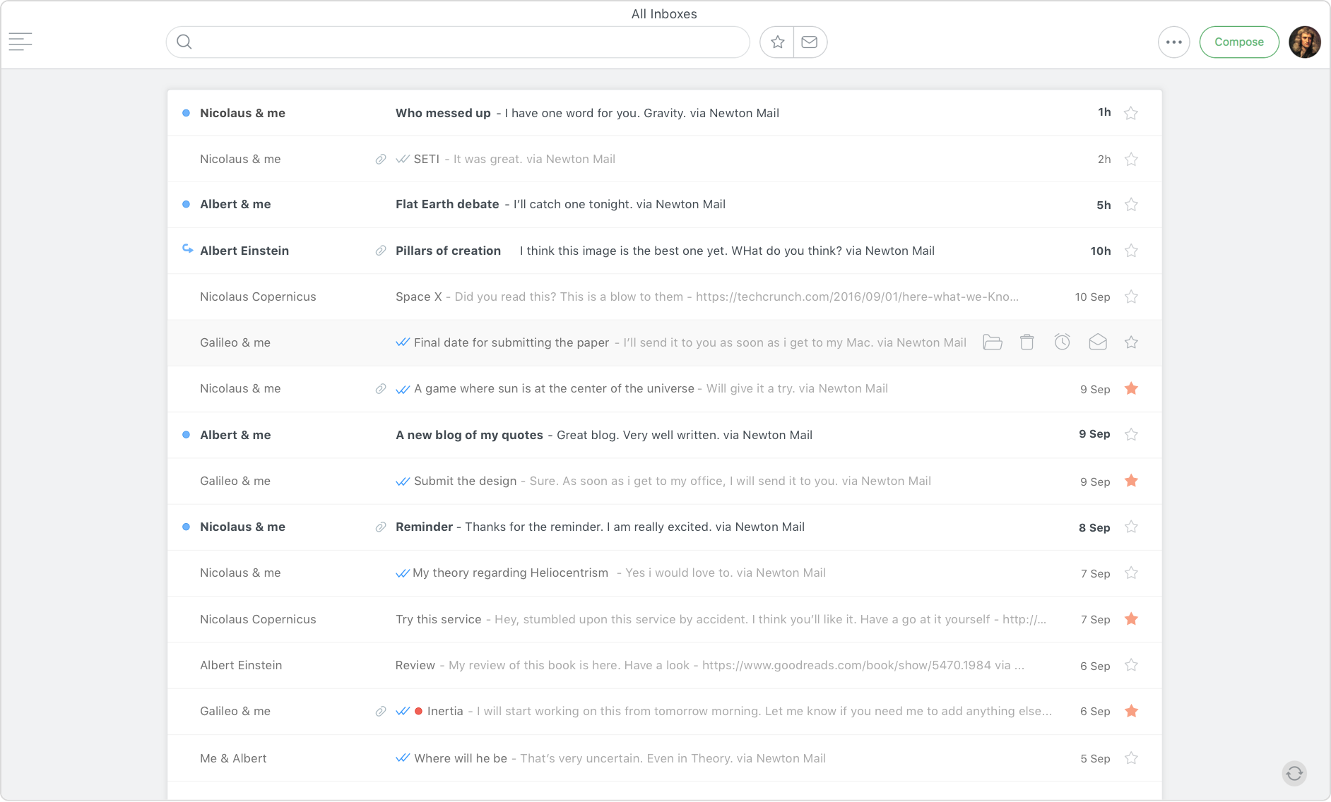
True Inbox gives you just one list, the inbox, with all the email conversations you need to deal with. No more jumping between Inbox and Sent folders.Before True Inbox, Inbox didn’t have the new conversations I started. They were hidden in the Sent folder till I get a reply. To follow up on them, I had to either a) remember to set ‘remind if not replied’ before sending the mail or b) had to later search for that mail or find it in Sent folder, and Snooze it to put it in Inbox. If I forget to do any one of the above, I lose track of those mails. With True Inbox, you don’t have to remember to do any of the above. It’s just right there in your task list. You can archive them if you don’t want to follow up, snooze for later or just keep them in the list till you are done.Read More
Vision / Design / Product Feature / 2018

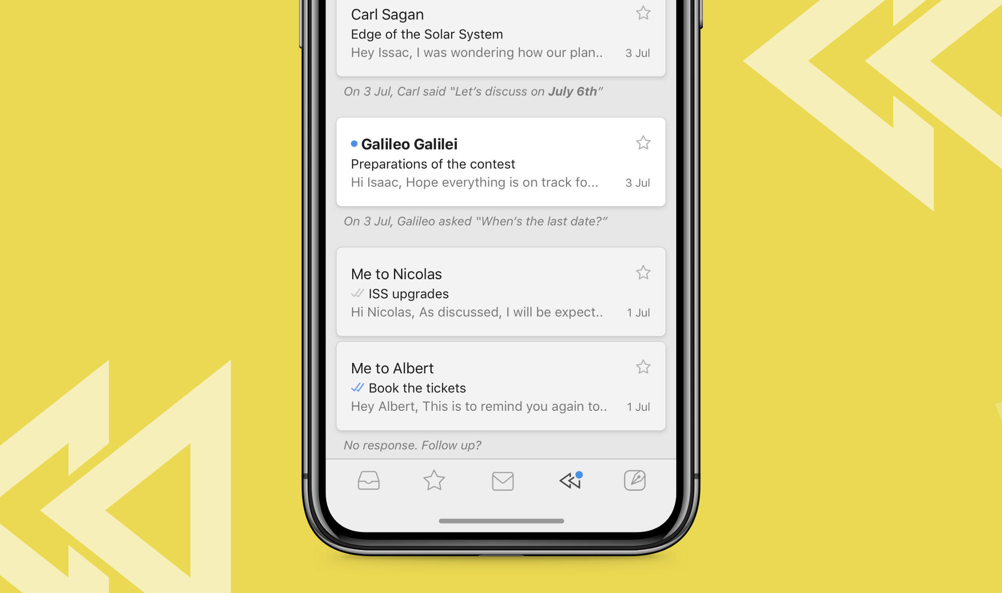
Recap automatically brings back conversations that are waiting for your reply or that need following up, in case you missed them. It also covers other mails with due dates, reminders etc., so that nothing slips through the cracks.Every morning, the Recap section in the app will show a blue dot whenever there is something that needs your attention. You can swipe to dismiss the mails if you are on top of them already, or push them aside to come back later. Recap will only show the most relevant conversations that you need to look at on a given day. They go away automatically when you deal with them, or after a few days so that you don’t have another list of clutter to manage. You can also choose to get notified if you have mails to recap.Read More
Vision / Design / Product Feature / 2016

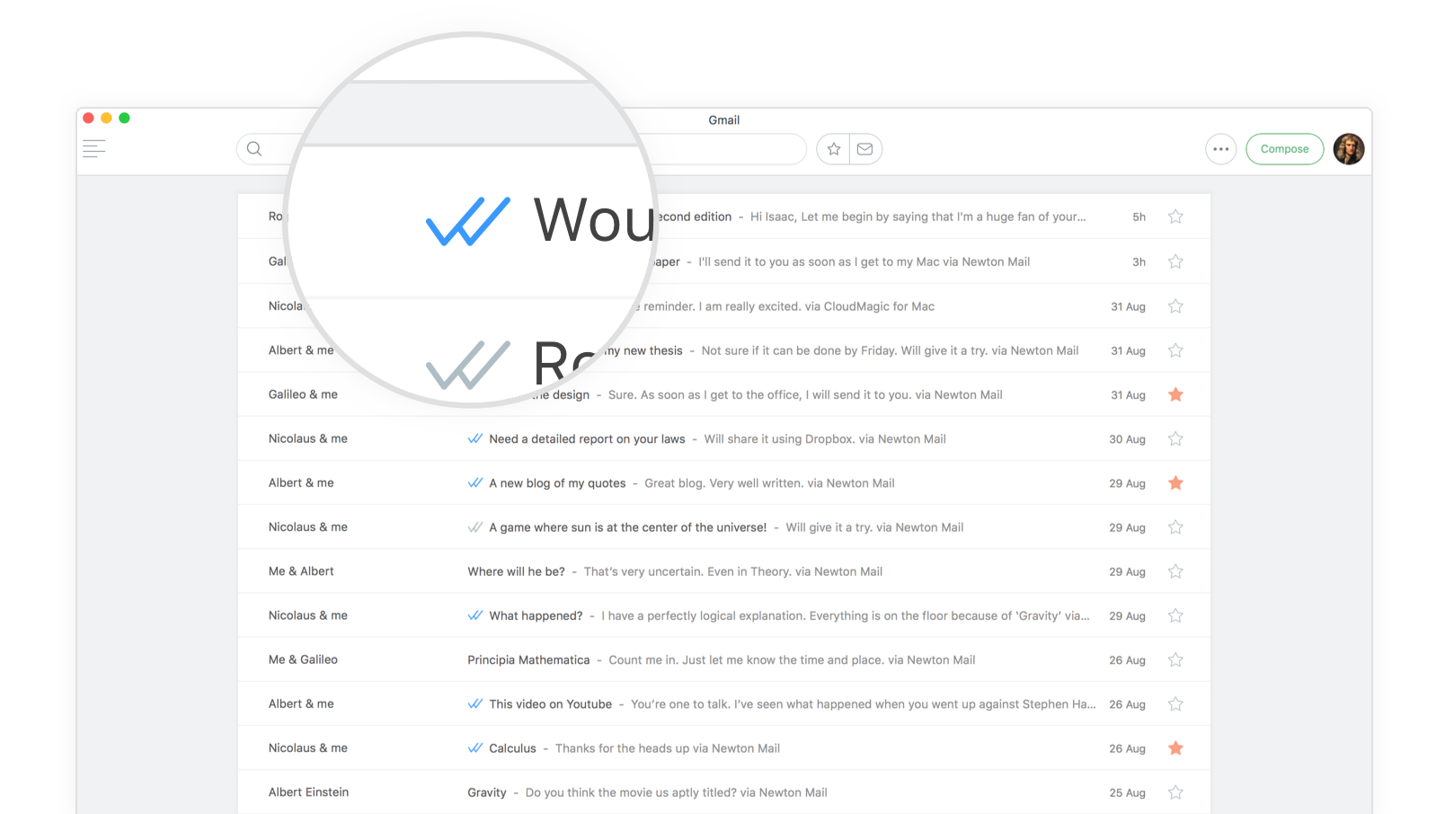
Know when, where and who read your email. Read Receipts comes baked in with Newton, with all your sent emails tracked without you having to do anything. Apart from giving you instant gratification, it also makes your follow-ups timely and effective. Just look for the blue ticks.Read more on the design of Read Receipts on Newton Mail.
Vision / Design / Product Feature / 2016

Get more info about the people who email you, right inside a conversation, on mobile and desktop.Sender Profile shows a summary of the sender, when they email you for the first time. Hit ‘Know More’ to get job title, organization, location, LinkedIn, Facebook and Twitter profiles. Flip the card for detailed organization info.However in true Newton style, this information does not come in the way of your primary email reading experience.Read more
Idea / 2017

Who said an email app should be all work and no fun? We added a little emotion in those cold empty states of the app to bring some warmth and a human touch. At Newton, we have always felt strongly towards such smaller details. These might be momentary states, but they can help generate strong affinity and emotional connect to a product. Our recipe — an element of open interpretation, a hint of meaning carefully seasoned with a degree of subtle humor — all within the context, such that our users would relate to it too.Needless to say our users loved it. They aspired to see them. Those were the rare moments a produtivity app made them smile. The empty states were one of the top reasons our users mentioned when they were asked why they loved Newton.Idea: Umesh. Copywriting and Illustrations: Abhishek Panda.Read More
Vision / Design / iOS / Android / 2015-2017

In true Newton style, we took a step back for the Calendar also 🙂. We re-imagined the traditional calendar interface with thoughtful design to become less, but better.Read More
Newton Calendar
Vision / Design / iOS / Android / 2015-2017
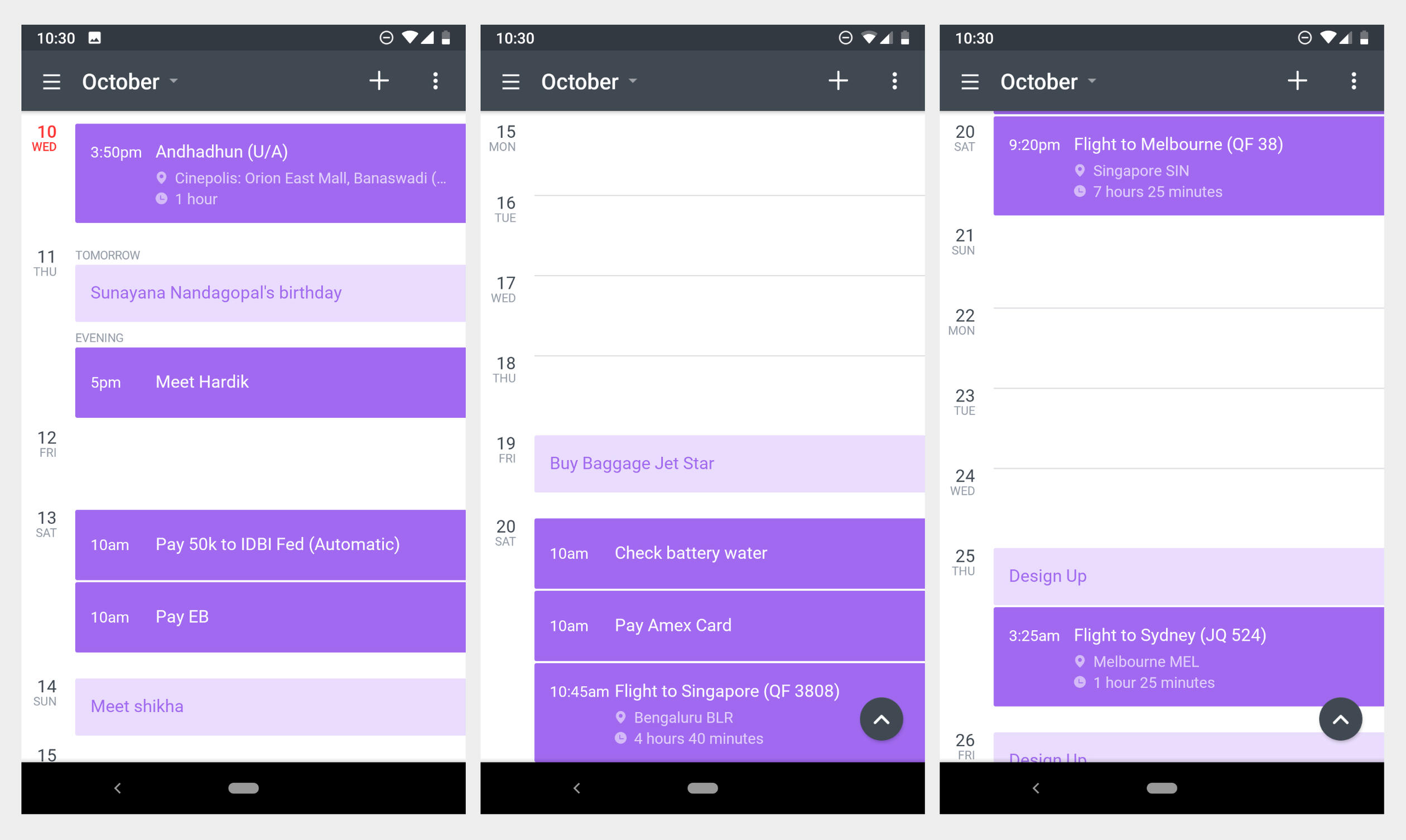
Problem“Email and Calendar go hand in hand for true mobile productivity.”Calendar is the biggest feature request we have ever received for Newton from day one. Many of our users got good access to their email on mobile for the first time only after Newton; but a proper calendar access on mobile was one thing that eluded them for a long time.When we started working on the Calendar, in true Newton style we took a step back to see how Calendars are today and how can they be improved. Newton was an email app fundamentally designed to be minimalistic and focussed. Our users loved us for that. So anything more than email in the app was making the product bloated. So, we wanted the Calendar to be comfortably separated from email. Also as a team we wanted to primarily focus on improving email and so, we wanted the calendar to be very minimal.The re-thinking“How does my day look like?”The first thing any calendar user wants to see is how their schedule looks like. It’s the place where they make mental notes on what they would be doing that day or the coming days. When would they be having some spare time. Before we started off, we did some research on how this significant part was done in other apps. All calendar apps had different views for displaying the events. We also spoke to people who were at various levels of calendar usage both on desktop and mobile. They all picked one of the following Calendar views as their default view based on their usage.Day View
Pros: It’s very convenient for a user to know what time of the day they would be free. Helps them focus on one particular day. It’s easy to know what’s coming up next. Visual cue on how long the event lasts. Also shows events that overlap.
Cons: Too spacious and airy; if a user doesn’t have many events, the day view doesn't really make sense.List View
Pros: Very focused and concise view for users to understand what events they have in their bucket.
Cons: Difficult to find free slots or days. Not great for creating a mental model of events in a timeline.Week View and Month View
Pros: Bird’s-eye view of the events. This view is useful in quickly figuring out free days. It works best for people who don’t have a lot of events in a day.
Cons: Users have difficulty creating a mental model of today's events. Sometimes All-day events clutter up the view and make it tough to find the desired event. Not optimum for Mobile devices.Our TakeWe started off with comparing similar views with one another. We felt, List view and Day view were very similar. List view was nothing but Day view with empty time slots removed. But the List view had few shortcomings which Day view tackled beautifully; noticeably, free time of the day and what’s coming next. List view helped in presenting events to users neatly with no visual strain on mobile. Week view and Month view most importantly, helped users figure out, how their days look like, at one glance.After analyzing everything, we wondered if these many views were actually necessary. Could we have just one view for all users to live on mobile? Provided it helped to achieve these objectives…
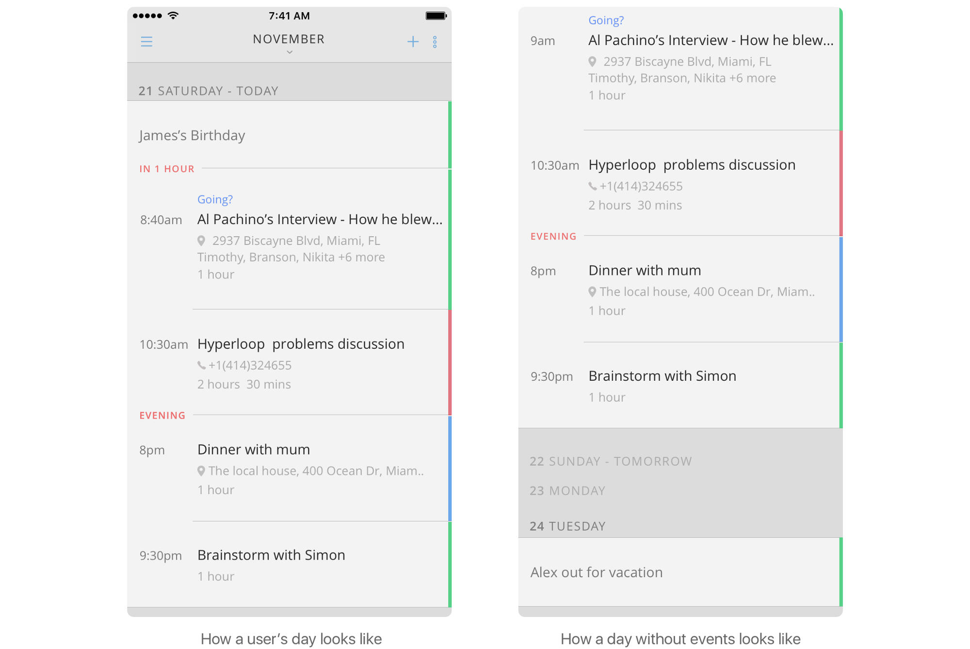
How does my day look like?
When is the next event and how far?
What times of the day am I free?
When are my free days?
How long does the event last?
Are there any overlaps?
Clear visuals of the event and its details
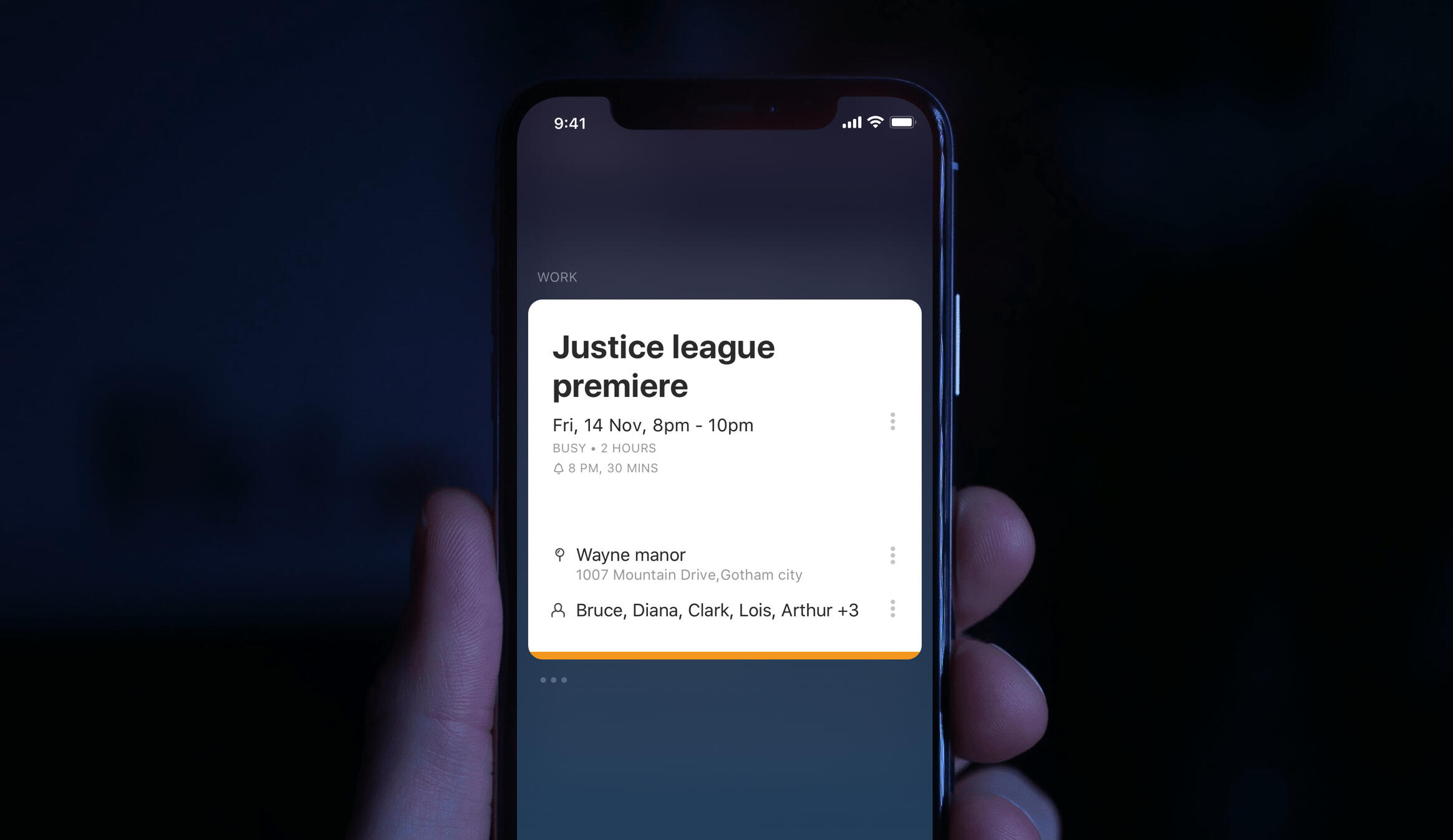
SolutionWe started our work with the Android app and we came up with the ‘Schedule View’ and tried to justify them to see if they met our goals.Newton Cal’s ‘Schedule View’ helps you plan better; a) know about your upcoming events with clear notes saying how far away they are, b) clearly see free days with a quick glance and 3) quickly add an event on a day at the next best available time that’s automatically picked.
Schedule view on Android
We also worked on the ‘Add Event’ screen to not show a long form but only the most most important information for an event to be added. We hid everything else under a ‘3 dots’ button.
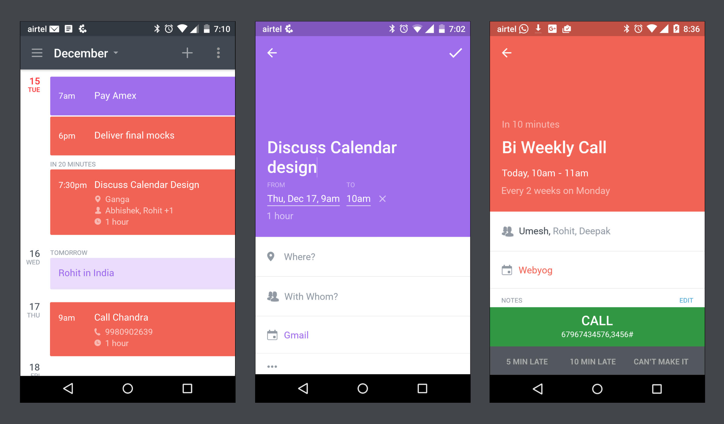
The ‘Event Details’ screen shows the same entry screen without the editability. Just tap on the info to edit it. Based on the event type it offers quick actions that come as handy when on the move. E.g. If it’s a meeting, and the time is closing in, the details screen would show quick actions ‘I’m running late’ and ‘I can’t make it’ as buttons. Tapping on them would send a mail to the organiser. If it’s a conference call it shows a one-click Call button with the Call in number and passcode. So no more copy pasting and switching between apps. All these actions would also reflect on the reliable notifications. It’s thoughtfully designed to manage your time efficiently when on the move. Truly mobile.The separate iOS appEven though the Calendar was bolted on to the email app on Android, it was treated like a standalone app for all practical purposes. In no case we wanted to pollute the simplicity of the email section and bloat the experience. But it had problems. As calendar was accessible only from the navigation bar of the email app, there was no easy way to multitask with calendar while composing an email or reading one. I had to literally quit email to go to calendar and then come back to email and navigate back to whatever I was doing. It was cumbersome, but at the same time adding it as a tab on Inbox, like other email apps, was also not solving it. After using it for some time we realised that the calendar should be a separate app that can be used in parallel with email. And this is what we came up with.
We quickly realised that there was a problem in using the same visual language as that of Newton iOS mail app. In Newton mail inbox, the primary focus is on the subject and the sender whereas in the case of Calendar there were many more factors that needed attention; for example Segregation of days — when a day ended or a day started, time slots for different times of the day, free days/eventless days etc. Simply put the visual language of our iOS email app didn't seem to fit well here. And we didn’t want to use the Android app’s Material design theme in iOS.Keeping all these issues in mind, we ventured on to find a new visual direction for the calendar app. Because it was an independent app we had the freedom to experiment and craft the best experience we could deliver. We also kept most of the things that worked well on android same on iOS. After many iterations, this is what we came up with.
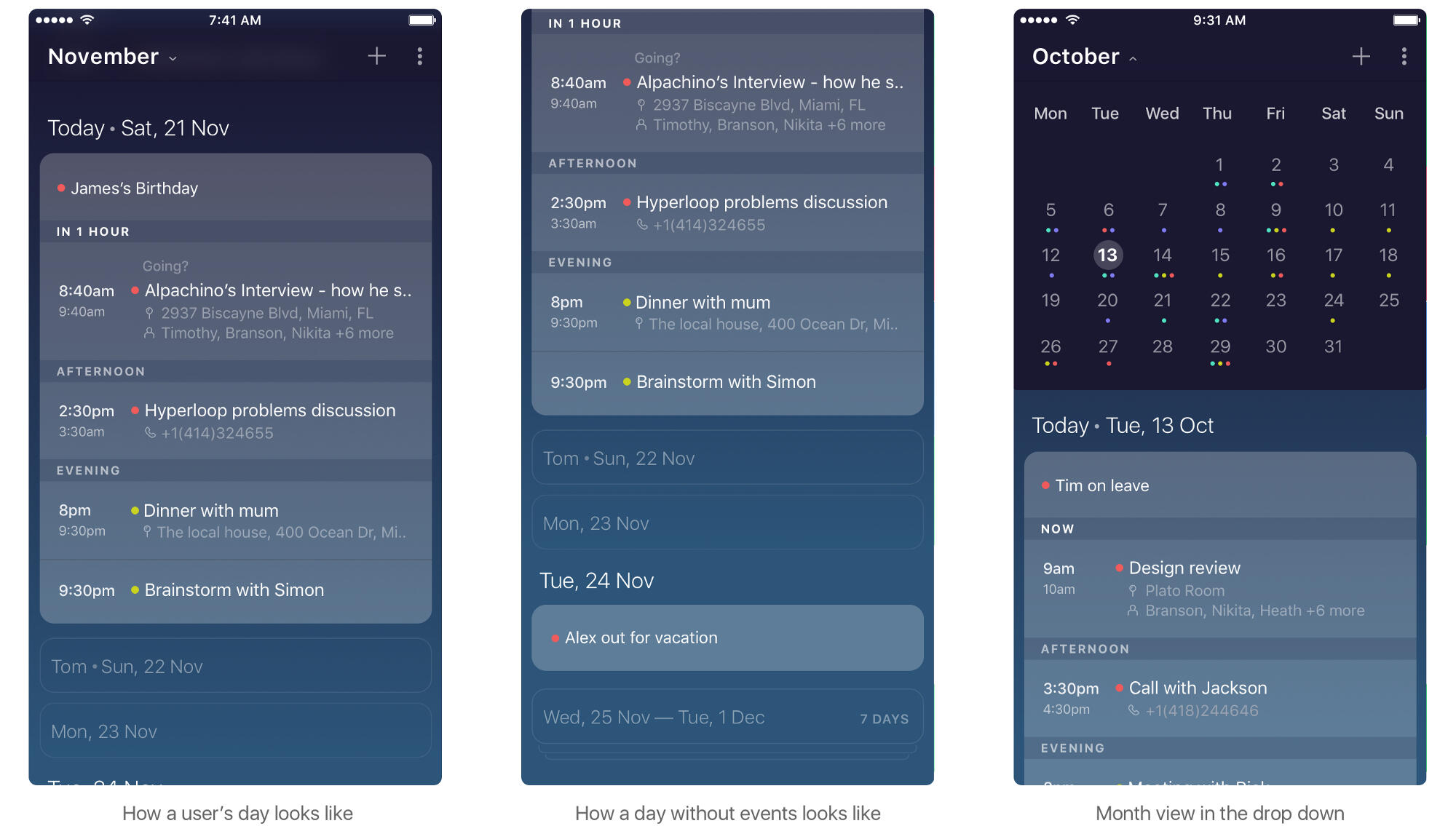
Read more on the design of the Schedule View on iOS app in detail.We also achieved a few notable improvements in the Add Event / Details screen from the Android app.Most of the time calendar events have just a title, date and time. Usually calendars had a Quick Add screen which was a text box that took the event title and date/time and a create button. To add more details there was a ‘add details’ button that would show the structured entry form. Some apps also supported Quick Add where I could enter anything into it and their Natural Language Processing (NLP) would interpret them pretty well.I really liked a quick add box but never liked the long form to enter more details on mobile. I also didn't like the idea of typing everything into one small box on mobile. On mobile, it’s easier to type a bit and then tap on suggestions and complete things in chunks. Also we didn't want to invest a lot in NLP to figure out meanings out of whatever that’s entered. Another problem was, even if we managed to make the NLP work, we had to show the user that it worked. Like how in Fantastical, whatever you type in the box fly down to show a structured form to make the user have confidence in the system. But, as always, we wanted to have less things on the screen.Even though in reality it’s not great to type everything about a complex event into a small text box on mobile, there was something nice to hear about it. It definitely sounded nicer than entering it in a long form. We wanted to explore more. Maybe there was something in between.I was enamoured by the Quartz mobile app the moment I used it. It showed me news in a chat-like application. A chat bot asks me questions and I respond by tapping on the options it gives. Even though it was chat I didn’t have to type anything. So Clever! A news app with no lists, no details, no navigation and no suggestions. A chat app with no typing. Well almost. Actually on mobile you tap on many buttons to type. Here I just tapped on one button to reply. Is there something we could learn from Quartz? I thought.What if we can make the user type the title and time and then tap on just one button instead of many to enter the rest of the details the best possible way on mobile? Almost same as typing, in any sequence, but assisted. Way better than a structured form.After numerous iterations, we finally came up with this.
Schedule, Event entry and details. See it in action
A quick add box (Card) that will support typing title, date and time.
For everything else, tap on the respective icon and continue tapping err typing in an assisted manner.
As you add more details they will get added to the Card. The card is the event and that’s what you save.
If you want to change something on the card, there isn’t an edit button. Just tap on what you want to change in the card and edit.
What we achieved
A ‘Schedule View’ that helps you plan better; know about your upcoming events and free slots with a quick glance.
Quickly add events. There’s just one route to create an event, instead of having to choose from 2 (type or form) like in other calendars. Just tap on the date on the Schedule view, type the time, event title and hit ‘Done’
Convenient. No long form entries. One can enter details to the event in any sequence. Lot of preset options for quick selections.
The user is confident that whatever she has entered is being interpreted right by the system. She is expected to type just the title and simple date and time in the quick add box. The hint and icons set the expectation well. Even if the user goes overboard with entering things, she will know where to stop after the initial playing around.
Even more minimal. Less things at any given point of time for the user to figure out.
It’s optimized to work well when on the move. E.g notify the organizer when you’re running late for a meeting or if you cannot make it; with just a tap.
It looks for the Call in number and passcode in Conference call events and creates a one-click Call button. So no more copy pasting and switching between apps.
Reliable notifications and actions ensure that you don’t miss out on anything.
Designed to be lightweight, the Calendar app is complementary to the Email app. As a separate app, it allows you to easily do the back-and-forth with email. You can directly go to Calendar from home screen. It doesn't bloat the email app and gives you the choice to pick the right calendar solution that suits you. It also allowed us to explore a new design language for a modern calendar on mobile. The traditional mobile calendar interface was re-imagined with subtle design improvements to become less, but better.We did a lot more improvements later on. And there’s more left.
Sender Profile
Vision / Design / Product Feature / 2016
Problem“Who just mailed me?”“I want to visit his Linkedin profile to know more about the sender before replying.”Whenever I get an email from someone I don’t know, I spend some time trying to find out more about the person before responding. There are Gmail and Outlook extensions that help me do this by putting a permanent sidebar showing information about every sender, even if I know them. Also, 80% emails are read on mobile first, and it takes around 12 minutes to research a person on mobile, which makes the these extensions ineffective. Even if there is something that works on mobile, it clutter up the interface.OpportunityRapportive was an extension that added a permanent right sidebar to Gmail and Outlook desktop apps that showed sender’s information from Linkedin and other social media. It later got acquired by Linkedin and they launched 'LinkedIn Intro’; an extension for the iOS email app. Intro added a permanent Linkedin summary of the sender while reading and writing a mail. Tapping on the summary showed the sender’s mutual connections, occupations, school etc. It was basically a mini Linkedin app running inside your email app. Basically both solutions bloated the underlying the application. Bad design.At the same time there was something good about Rapportive. The fact that the information was just there without the user having to do anything to get it. It was ambient.What if there can be a solution that will work well on mobile and desktop alike. Modern. "Baked in" to the overall emailing experience. Something that doesn't stick out as a sore thumb.Solution“It is powerful for 1 out of 10 mails. For rest, it is a waste of the precious small screen real estate. On desktop, you can afford such distractions. Not on mobile by any chance.”
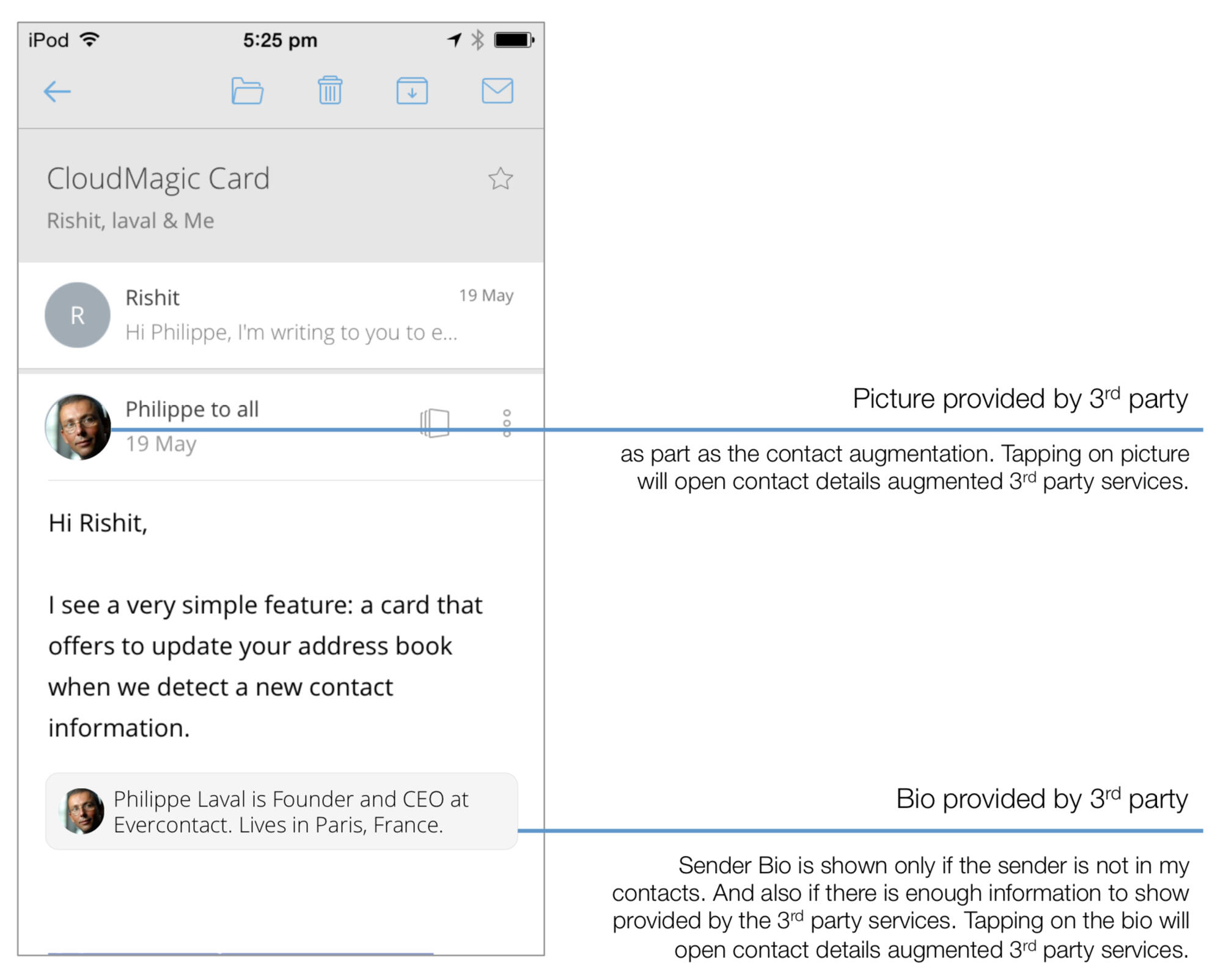
A permanent sidebar on a desktop application was comparatively an acceptable solution but the mobile implementation was downright bad. When we started thinking of a better solution, like always it was mobile first. We wanted to first crack the best mobile experience and then extend it to desktop. We built a prototype showing a one line summary right below the sender name inside Newton. Not a great solution as it made the header look busy, and also mostly useless as we had to ellipsize the information to fit it in one line. Nevertheless we started using it.The biggest breakthrough came from the light bulb moment when we realised that we don’t need to see a summary for everyone all the time. It’s required only when someone who I don’t know sends a mail to me for the first time. Someone who is not in my contacts list. That too only when I’m reading the mail. Not even in compose; as there is very less chance that I will send a mail to someone without knowing who he is.This thinking lead us to not showing the one line summary below the name but instead we could take up more space and show it after the mail, below the signature. Like those articles that show more information about the author in the end. And it worked beautifully on mobile and desktop.
The Design
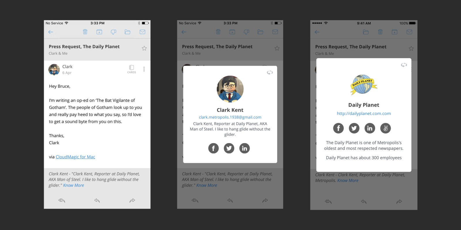
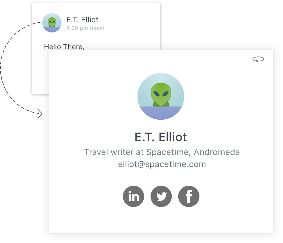
Left: Sender Profile heads-up on mobile. Middle: Sender Profile card showing sender information. Right: Flipped card showing organization details.
In true Newton style, Sender Profile does not come in the way of your primary email reading experience. Whenever you get an email from someone who’s not a part of your Contacts, it will show a subtle heads up in the end of the mail, giving you a summary of the sender. Hit ‘More’ to show the Sender Profile card showing the Sender’s name, picture, job title, organization, location, LinkedIn and Twitter profiles. Flip the card for organization details.
Sender Profile heads-up on desktop.
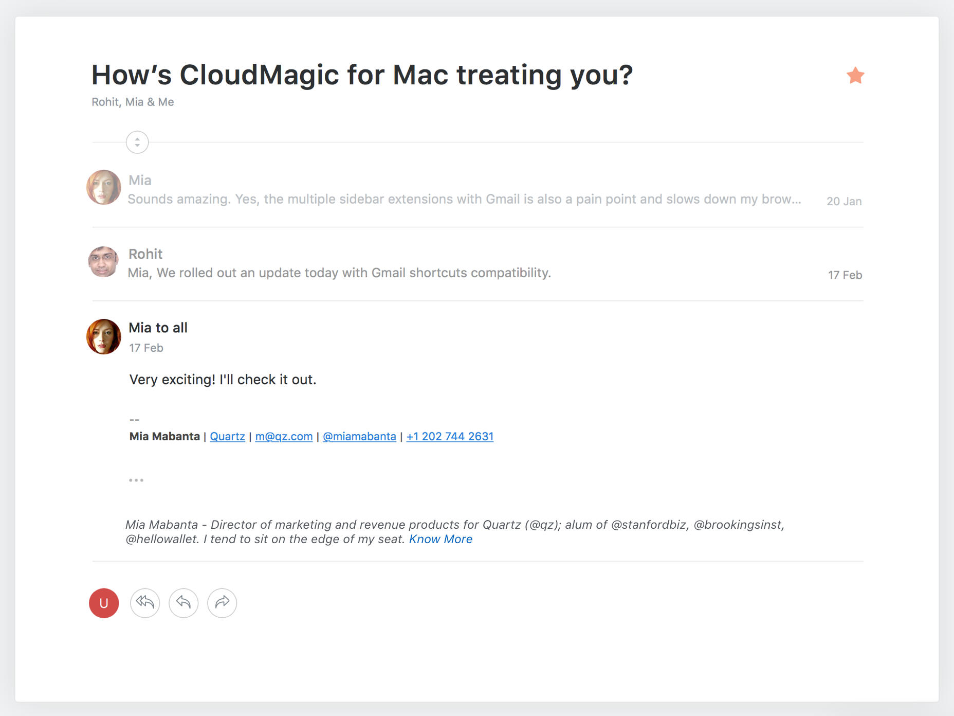
The summary (we called it the 'Heads-Up') showed the sender’s Twitter bio if available. As a fallback, if Twitter bio was not available but we have Linkedin info it showedUmesh (Product Designer at CloudMagic, Bangalore) is on LinkedIn. Know moreIf title and organization was not available it just saidUmesh is on LinkedIn. Know moreSender Profile also adds every sender with a display picture picked from social media right on the mail header. Like Twitter, tapping on the display picture of the sender showed the Sender Profile card in case you want to see it for existing contacts.On an average, we spend 12 minutes researching on people who email us for the first time. Sender Profile simplified your research, giving you the sender’s job, organization and social media profiles in a single click.No one is an alien anymore! ☺️👽
Read Receipts on Newton
Vision / Design / Product Feature / 2016
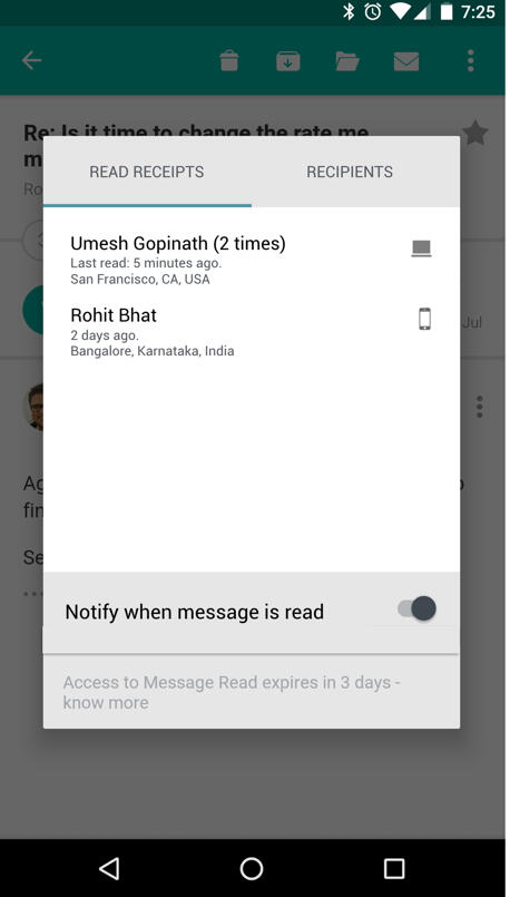
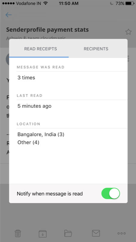
Problem“What happens to my email after I hit send?”“Was it read? Should I wait or follow up?”With Email Tracking, you get to know who read your email and when. It adds context to your conversations. But unfortunately, all the email tracking tools out there are messy and bloated, and mostly work with Gmail only, on Chrome. Almost all existing solutions were designed for a sales person's use case with dashboards and activity feeds, and so, they are not consumer grade. 80% of emailing is now done on mobile devices which throws in even more complications for email tracking tools.OpportunityCan we make Email Read Receipts consumer grade by making it enabled by default, light weight like the modern messaging applications? Designed for today’s entrepreneurs and independent professionals (software professionals, business consultants, designers, investors, movie makers, musicians, music producers, lawyers, speakers, journalists etc.). Actually they all are sales people to an extent as they are also trying to sell their services or run a business. But that doesn’t mean they need serious sales tools for emailing (but wouldn't mind some aspects of it).SolutionRead Receipts baked into every email you send by default out of the box. No need to 'enable tracking'. Simple grey ticks show when the mail is sent. The ticks turn blue, when email is read. Tap on them to know who read and when. You can optionally choose to get notified when your email is read, anytime after you send the mail. A mobile first solution, inspired by WhatsApp.User flow and screensBlue ticks show on Inbox if the last mail in a conversation is sent by you. A quick glance on a conversation can show you if the mail was read.Opening a conversation will show ticks on all the mails you sent. Tapping on the ticks shows the user how fresh the email he sent is in the recipient’s mind. How many times the mail was read and the last read time. Also, the location gives an idea of whether he/she is at work, home or traveling. This summary gives the user a good idea of his next step - whether he should still wait for a reply or follow up.
Left: Read Receipts on mobile. Middle: Individual Read receipts. Right: Non Individual Read Reciepts.
Individual vs Non individual read receiptsFor Exchange email accounts, it's technically not possible to show who exactly read the mail when there are multiple recipients. So a fallback version of the summary was also designed to just show howmany times the mail was read and the locations. So if you send a mail to 2 people, and if it says read 2 times, you can make a guess that both of them read it and ofcourse correlating with the locations.NotificationsUsers can optionally choose to get notifications when the mail is read before or even after sending the mail.
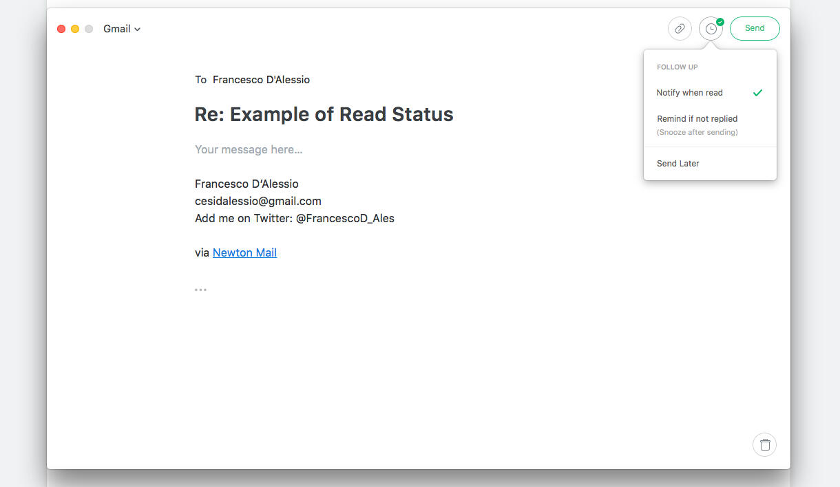
While sending an email, choose to get notified when the mail is read.
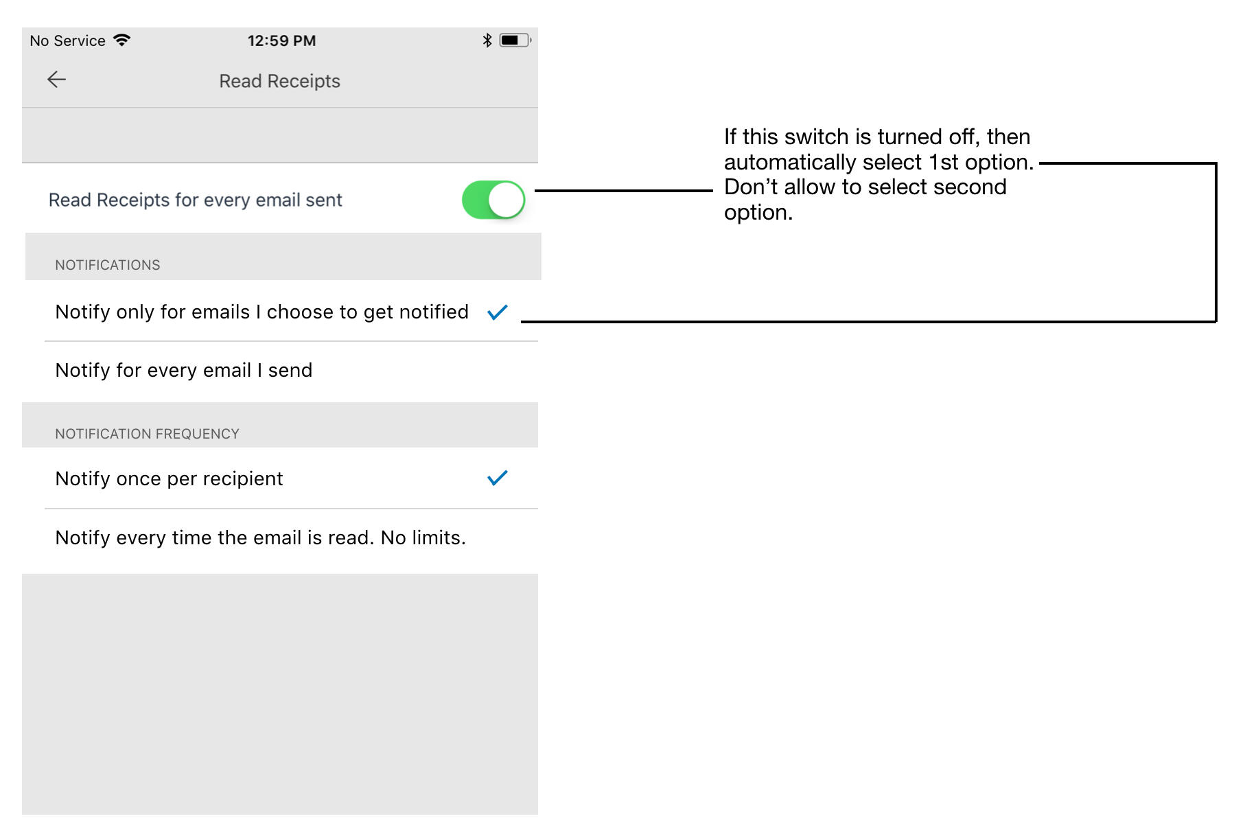
Read Receipts Notification Settings
Even though Read Receipts by default comes with a light weight Whatsapp like implementation, optionally allowing user to turn on notification on a per email basis, it allows power users to customize it further to their liking. In Settings the user can turn on Read Receipts notifications for every mail sent. It also gives the option to get notified once per recipient or every time the mail is opened. This way the user can pretty much use the notification center of his device as his email activity feed, instead of bloating the app with an activity feed for every user.
Recap on Newton
Vision / Design / Product Feature / 2018
Problem“The dreaded email workflows”Every day most of us do our best to achieve Inbox Zero or a similar GTD workflow to take control of our email overload problem. Some of us apply star, mark important mails as unread, archive to clean up, snooze for later, move into folders based on some logic, try new workflows and what not, only to be on top of email and to get things done on time. Even though modern email apps eased our way a lot through these workflows by way of better design, newer features and automation, they still expect us to be extremely disciplined with email. The onus is still on the user to make sure nothing goes missing. And so, we still live stressed about our workflows and in the fear of missing out.Opportunity“Can I get a reminder for all the mails I sent but haven’t got a reply, so that I can follow up?”Basically all email workflows are about removing unnecessary mails, creating a reminder for things to do and reply, and reminders to follow up on mails that we sent. Different people use different mechanisms but they all intend to do the same. We started thinking; can my email app learn my emailing habits and find out if I have missed out on something and remind me to reply or follow up? Without me having to do much. Without workflows.SolutionWe started with the assumption that we’ll simply create a reminder for every mail a user sends starting a new conversation, as we all expect a reply to almost all mails we send. Some users had requested for it too. Also for all inactive conversations that maybe waiting for me to look at. Along with it, we could also bring up mails with dates mentioned. So, initially we broadly categorised them under 3 sections - ‘Recent date mentioned’, ‘No response’ and ‘No Activity’.

The 'Today' prototype
We built a prototype and started using it internally. We code named the feature ‘Today’. The reason being that it’s acting as an assistant telling me to follow up on a list of mails... today.We quickly realised that reminding me about all conversations I start saying ‘no response’ is a bad idea. We had to find out if they really needed follow-up. The same way we had to find out if the mails I received really required me to reply. So, we split the 2 big categories into Requests and Commitments. And they were further split into ‘Requests - I received and sent’ and ‘Commitments - I received and sent’.Also conversations appearing out of nowhere with the message ‘recent date mentioned’ threw us off most of the times. We had to open the conversation and read through it to make sense out of it. It made us think a lot. So we decided to add a more specific one-liner reason to every conversations that appear in Today. Initially those reasons were very specific like ‘Waiting for your reply’, but they were not working a lot of cases. So we decided to make it a bit broad and non decisive like a machine suggesting something like ‘You may want to reply’. After a lot of fine tuning this is what we came up with that made sense.Mails with date: On 1st April, John said “It’ll be available on 15th April”Request I sent: No response. Follow up?Request I received: You may want to reply.Commitment I received: Just checking. Needs follow up?Commitment I sent: Just checking. Have you concluded?We made changes to the prototype and started using again. We also opened the prototype to more people in team. This time we were getting better results with clearer reasons but at the wrong time. Sometimes too early and sometimes late. So we worked on fine tuning the right time for these conversations to appear so that they are not too early or late.More iterations later we also added a ‘Questions - i received and sent’ section. These were anyway a subset of Requests but we could show better reasons.Question I got: On 1st April, John asked “When are you going to give this to me?”We also renamed the feature as ‘Recap’ as instead of it becoming my only list to look at today, it was more like a rear view mirror for my email coming back to me in case in missed them. More like a filter.Recap automatically brings back conversations that are waiting for your reply or that need following up, in case you missed them. It also covers other mails with due dates, reminders etc., so that nothing slips through the cracks.User testingThis time we opened the feature to our beta users to test it out. The first feedback we got was that they were excited about the feature but they didn’t see anything in the recap section immediately. This was a problem we didn’t have a good solution for as the system would only pick the recent mails (upto a week ago) to follow up to avoid a lot of redundancy. To ease this problem a bit we then moved the recent timeline to 3 weeks when a user start using it. We also added some clear messaging in the Recap section that there will be messages showing up only if there is something that the user has missed out following up and she will be notified about it.The second big feedback was that there are lot of machine generated notifications showing up on Recap, which didn’t make sense all the time. Some notifications with dates made sense but most of the others were junk. So we removed machine generated mails from Recap for the time being till we have a good solution. It would now show only mails sent by real people.The third and biggest feedback was that Recap was not very useful for people who already have a effective workflow - like Inbox Zero. This is something we were aware of and had taken a call that we’ll ignore it in the first version and wait for more feedback. So in the first version we added a setting to turn off Recap altogether for users who don’t find the value. This was required anyway. We later designed a mechanism where the system can sense some type of GTD mechanism the user is having and fine tune the follow up reminders to be even less aggressive.
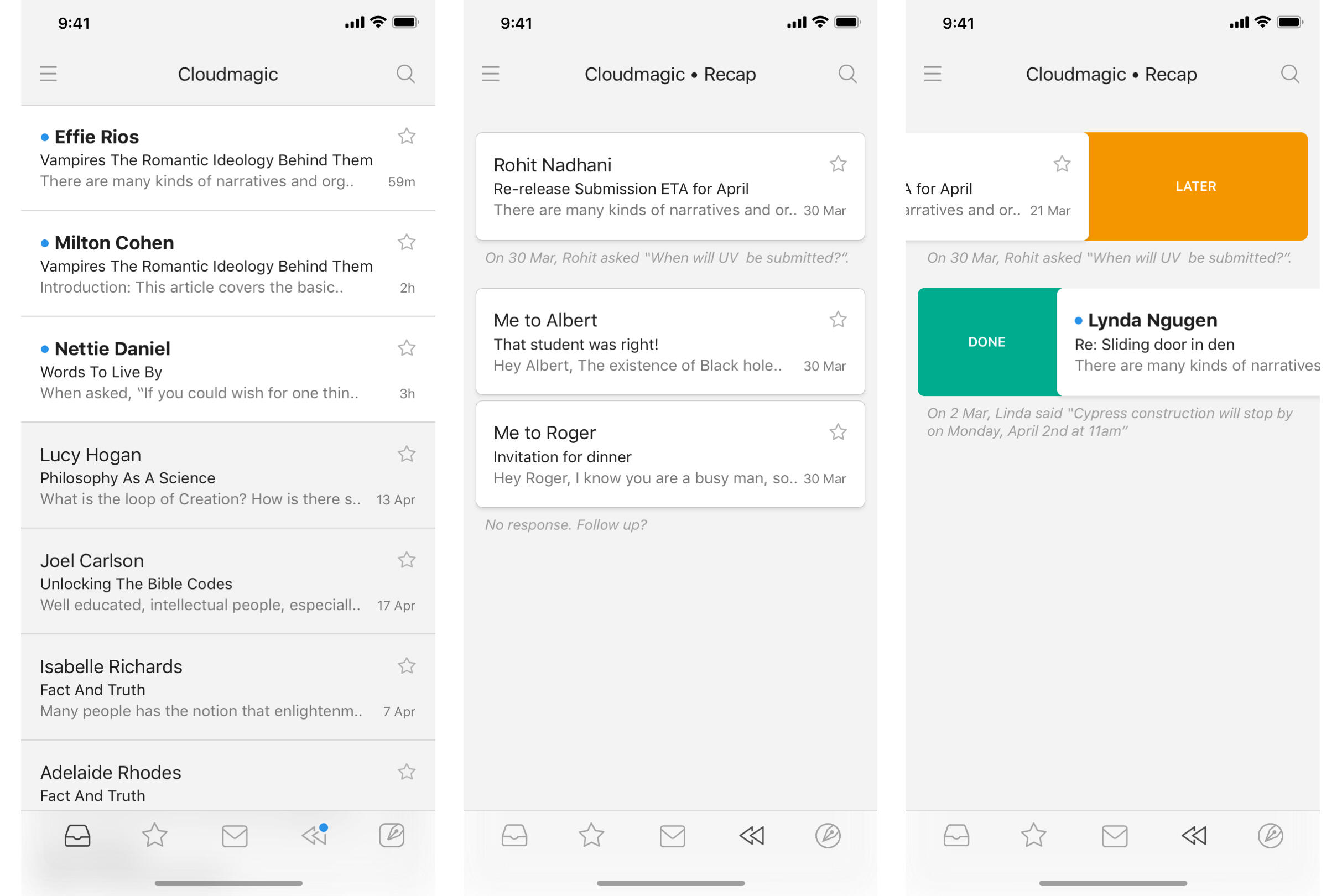
Recap on mobile
How does it work?Every morning, the Recap section in the app will show a blue dot whenever there is something that needs your attention. You can swipe to dismiss the mails if you are on top of them already, or push them aside to come back later. Recap will only show the most relevant conversations that you need to look at on a given day. They go away automatically when you deal with them, or after a few days so that you don’t have another list of clutter to manage. You can also choose to get notified if you have mails to recap.Recap doesn’t meddle with your workflow, instead complements it in a subtle yet effective manner. It’s not a task list. It gives you enough time to take care of the mails yourself and reminds you only if it looks like you have missed to reply or follow up (unless the mail has dates mentioned that you shouldn't miss).Never had a workflow? Have you been sloppy with email? Fret not, Recap has your back. It’s designed to make you diligent at emailing without expecting you to follow any strict manual workflows. We have been using it and fine tuning it internally for some time. It works for us and we can assure you that it will work for you too.
Newton
Vision / Design / SaaS / 2013-2019 / Newtonhq.com
ProblemEmail consumes a significant chunk of time in our work lives. Ironically though, email apps are considered to be an emotionless-transactional-productivity tool. The more it does, the better it is. It is somehow assumed that every email user needs an army of features to manage their emails, with all thrown into one fever inducing dashboard. The extra clutter and feature overload actually resulted in people doing more to achieve less. Further, they get distracted in the labyrinth of features, interface elements and not to mention the emails themselves. It’s funny that to solve this clutter problem, more and more “smarter” features were added, such as ones deciding what emails are important to show and pushing the rest into obscurity. This only made people live in constant fear of losing their emails or missing out on something important.OpportunityNo one really tried to make email friendly to people who spend a whole lot of time emailing, but don’t need half the "email features". Emailing for the most part is about scanning, reading and writing. Oddly and surprisingly enough, there is little to no emphasis on improving these basic experiences. With all our advancements in Science & Technology and Design, it is hard to imagine how no remarkable attempt has been made in improving these basic experiences. Let alone pushing them to the next level.Solution“A delightful email app with just enough features for modern day business communication.”When we started designing Newton we basically took a lot of steps back to see the real problem in the bigger picture. From back there, it seemed obvious that the basic experiences needed strengthening before stacking them up with dazzling features. So, we went ahead and made emailing clutter free, and squarely focussed on lightning fast performance with great reading and writing experiences. Everything else simply worked as expected with features appearing only when required. By being simple, intuitive and familiar to use, it didn’t force you to learn a new workflow. It didn’t pretend to be smarter, or dictate what’s important for you. Newton simply solved the email problem by making it a delight to use. It encouraged the user to focus, understand better, communicate better, take better actions, and quickly get back to life.
Clean and focused Inbox to quickly show you what matters the most.
Distraction-free Conversation View that makes reading stress-free.
Blissful Compose mode, where nothing comes between you and what you write.
Features for modern day business communicationDesigned as mobile first, all these features were built around the core aspect of the app - Read and Write email. None of them stood out and took centerstage. They were baked in to just work out of the box and be available whenever required.
Read Receipts - Know when, where and who read your email.
Recap - Revisit unresolved conversations that you might have missed.
Tidy Inbox - Remove newsletters and other distractions from Inbox.
True Inbox - When you start a new conversation, you’ll see it in Inbox. There’s no need to go to Sent folder anymore.
Sender Profile - Get useful insights about senders.
Snooze - Deal with emails only when you’re ready.
Connected Apps - Save emails to your favorite to-do apps.
Send Later - Schedule emails for the perfect moment.
Designed to work on all devices

Mac, Windows, iOS and Android.
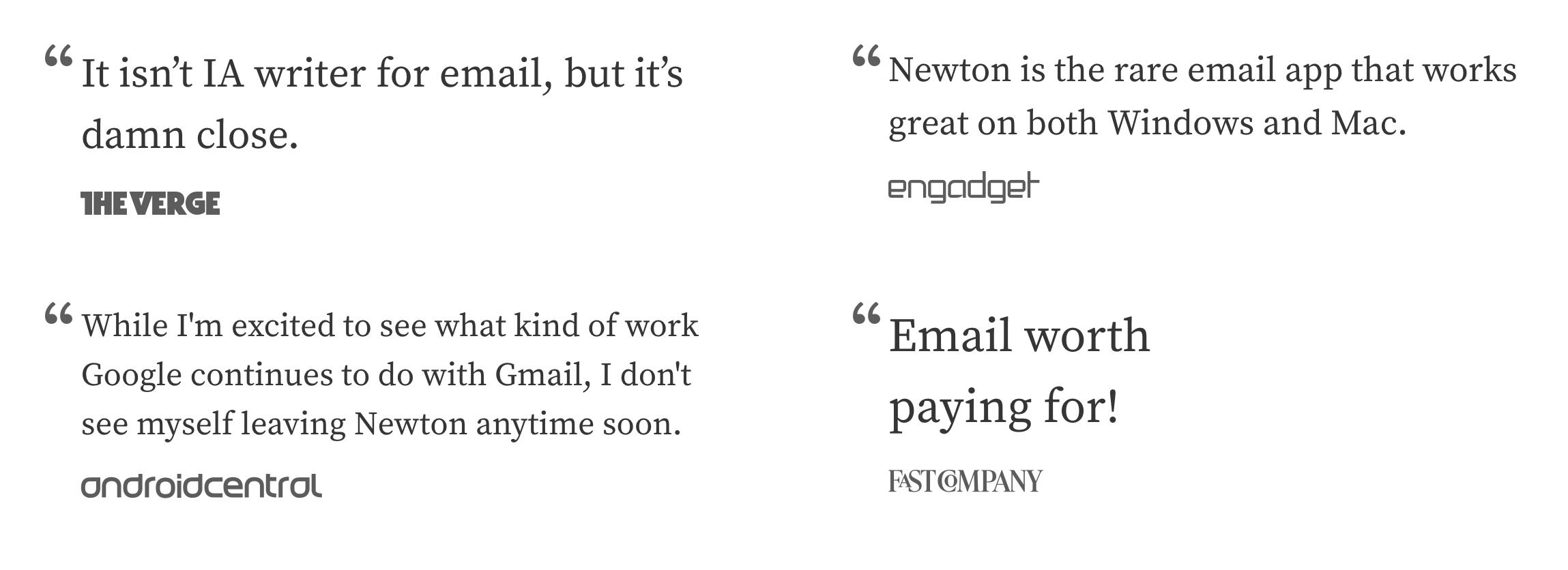
Loved by critics, press and 40K subscribers.